Chase
Fintech
UX Designer & Researcher
Case Study
The Challenge
Improve a full capacity of finance management for Millennials
Chase bank is the six largest bank in the world with a mission to help people improve their financial health. Chase's current mobile app is very well rated, but limited to spending and making payments. To improve a full capacity of finance management and to focus on Millennial users, Chase wants to round out their offerings by providing users with personalized features that allow them to manage their personal finances.
The Objectives
To design a new personal finance management features for Millennials that embeds within the current Chase app.
To follow Chase’s existing design patterns and integrate the new features into the current app for a smooth user experience.
Process Overview
Research & Analysis: Research began with competitive and industry analysis to understand Millennial banking behaviors and mobile-first finance trends. This was supported by contextual inquiry interviews with students, professionals, and entrepreneurs, which revealed that while users trusted Chase for core banking, many found financial management tools overly complex and lacking personalization. These insights highlighted an opportunity for Chase to expand beyond transactions into goal-oriented financial management.
Information Architecture: Based on research findings, the app’s information architecture was restructured to support new personal finance features while preserving Chase’s existing navigation patterns. Autosave, budgeting, and reporting tools were organized around user goals, reducing friction and allowing new features to feel naturally embedded within the current app experience.
Wireframing & Prototyping: Low-fidelity wireframes were created through sketches and whiteboard exercises to quickly validate layouts and user flows. After refining the structure, high-fidelity wireframes were designed in Sketch, closely matching Chase’s UI patterns, and connected into an interactive mobile prototype in Marvel to simulate real user interactions.
Usability Testing: Usability feedback was gathered through prototype walkthroughs focused on key tasks such as setting up autosave rules and managing monthly budgets. Testing emphasized the importance of minimizing steps and keeping users within a single, continuous flow, leading to refinements in navigation clarity and visual hierarchy.
Visual Design & Style Guide:A cohesive visual system was created to extend Chase’s existing brand across the new features. This included defining color usage, typography, and reusable UI components, supported by a style guide and UI kit to ensure consistency, scalability, and future design alignment.
Competitve Research & Analysis
I started off secondary research to gain a general understanding of the bank/finance industry and Chase’s demographic. Although Chase is serving over half of America’s households, the latest study show a continual increase of mobile usage for banking and Millennials take a majority for Chase mobile app. I also thoroughly analyzed Chase’s features and less customized functionality when designing the new personal management features. After learning more about Chase, I wanted to study more about how Chase users would differ from users of major finance services. The interesting facts found out about millennial users that 65% of millennials users are actively using non-traditional bank (such as google and apple) for their finance activities, 25% millennial users are willing to switch to non-traditional for their major finance management and 43% of millennial users do their finance management using mobile as top finance services are also used prioritizing on mobile devices
User Research
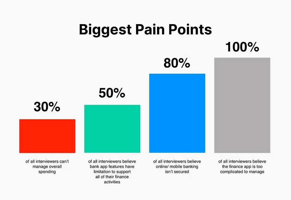
To learn more about the users, I conducted contextual inquiry interviews with potential Chase app users at places where our target audience would visit (List New School library and Blue Bottle Coffee shop next to WeWork office in Bryant Park, NYC). The people I spoke to were young students, professionals, and entrepreneurs, the target audience for new features. There are a few insights I learned from the discussions:
More than half millennials believe that finance app is too hard or complicated to manage their daily finance activities.
Define User
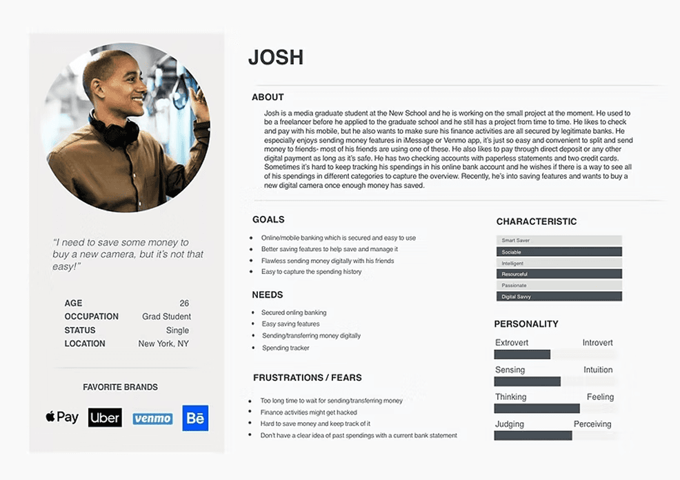
Based on the research findings and reflecting Chase’s target demographic, I created a persona for Josh to represent the findings from the research. Josh is a young student of the Millennial generation who needs help on saving. By giving context and personality to the research data, we can synchronize their behaviors and better emphasize with the target user throughout the design process. To accomplish Chase’s scope of new features on mobile devices, I primarily focused on millennial users.
“I need to save some money to buy a new camera, but it’s not that easy”
“I need to have a finance ownership and recently am interested in investing”
From research findings, the interviews seemed satisfied with current features, but they definitely needed more personalized features to accomplish their finance goals. It was important to uncover their pains and gains clearly to enhancing bank experiences for Chase users.
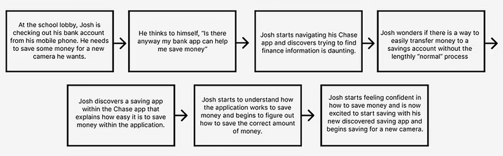
Storyboard for their journey
To further understand the user and problem space, I drafted a short storyboard illustrating Josh’s usage of Chase app. This quickly communicates Josh’s problem and how Chase app could offer a solution to this problem.
Project Goals
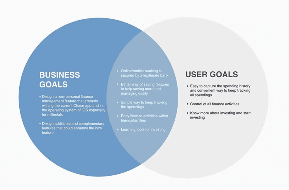
After defining and emphasizing with Josh and Emma, I started to define business goals and user goals to make sure I could build a solution to both sides. It’s so important to clearly understand what Chase’s original goals and what Chase could expect to achieve from starting to design a solution. Then these goals are across matched with users’ goals to ideate what are the common goals I want to design to solve.
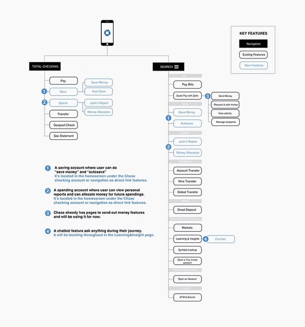
Sitemap
After common goals, I researched features from major competitors based on Josh’s and Emma’s needs. These analysis led me to correlate best features from the top finance management companies for Chase users. These analysis opened a design question to explore:
User Flows
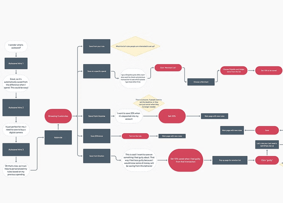
To analyze the flow of the new features, I mapped out various ways of user flows based on scenarios I found from the primary research. This helped me learn which screens and UI elements were needed to implement the new features, while considering how to optimize use flows.
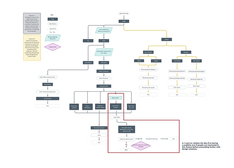
Autosave/Budget
Then, I delved deeper into two important features: autosave and budget. I created task flows for Josh's initial autosave setup and setting up next month's budget. This helped me better grasp how personas behave and make decisions throughout the process, leading to a more informed design solution.
Design Audit
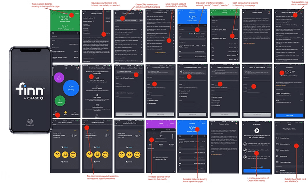
Before creating wireframes, I studied Chase's mobile app to become familiar with its current design. I took notes on the main features and also looked into the latest features of other top apps for Millennials. Finn's thorough research and user testing had already led to the development of suitable features for Millennials. I aimed to leverage these features to my advantage. This process helped me better grasp Chase's design style and also learn from Finn's advanced features. I identified opportunities to enhance new features and explored how to integrate them effectively.
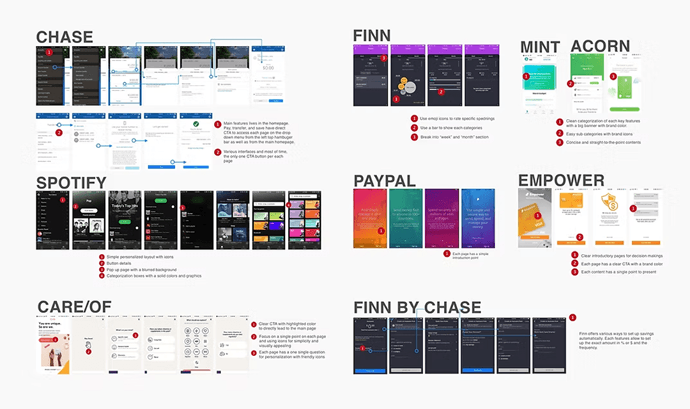
Design Audit
Before creating wireframes, I studied Chase's mobile app to become familiar with its current design. I took notes on the main features and also looked into the latest features of other top apps for Millennials. Finn's thorough research and user testing had already led to the development of suitable features for Millennials. I aimed to leverage these features to my advantage. This process helped me better grasp Chase's design style and also learn from Finn's advanced features. I identified opportunities to enhance new features and explored how to integrate them effectively.
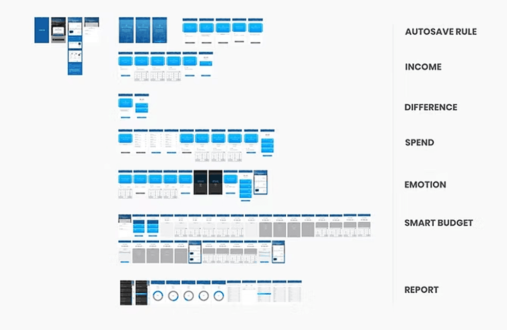
Low-Fidelity Wireframing
I initially sketched low-fidelity wireframe by sketching in post-its and whiteboard. I found it’s very beneficial to quickly and clearly map out all necessary features and layouts to see overall flows before digging into high-fidelity details and prepare me to use my time more efficiently.
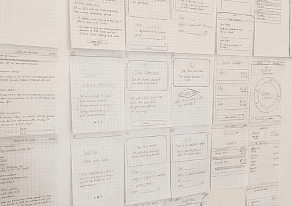
Sketches
I initially sketched low-fidelity wireframe by sketching in post-its and whiteboard. I found it’s very beneficial to quickly and clearly map out all necessary features and layouts to see overall flows before digging into high-fidelity details and prepare me to use my time more efficiently.
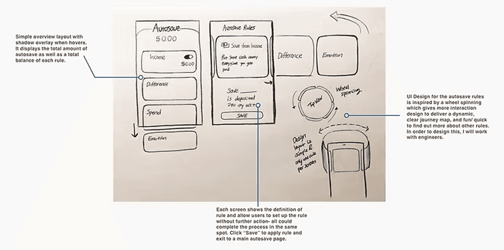
Autosave Feature
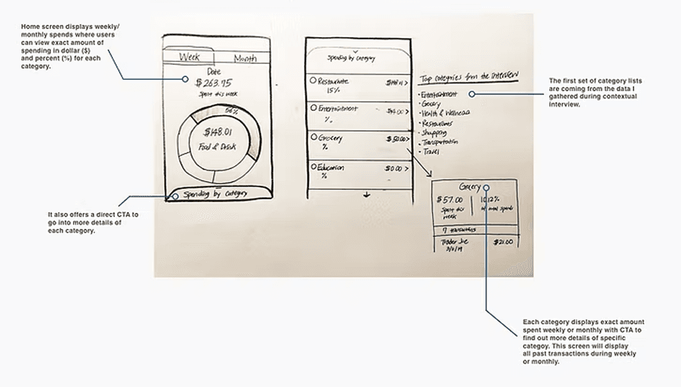
Report Feature
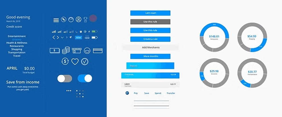
Style Guide
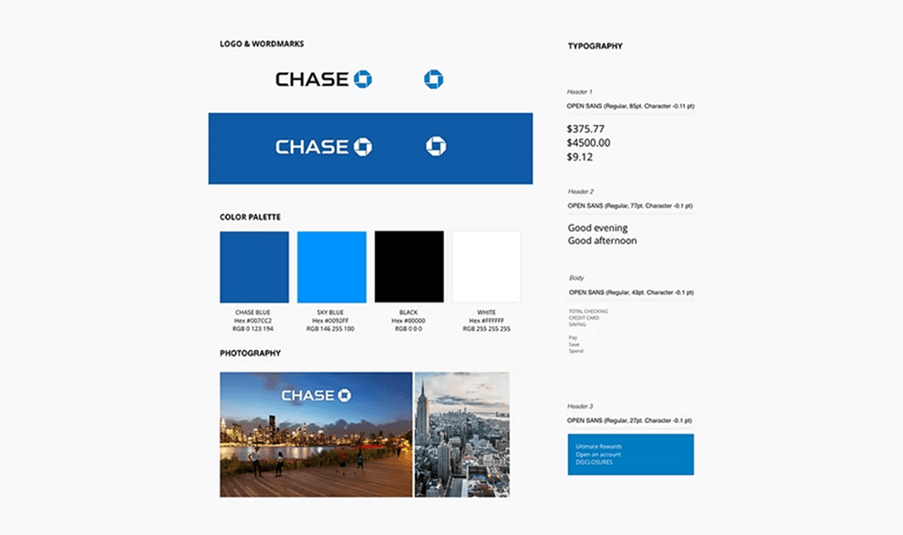
Before creating high-fidelity wireframe, I created a style guide to enhance Chase’s branding to ensure cohesiveness.
High-Fidelity Wireframing
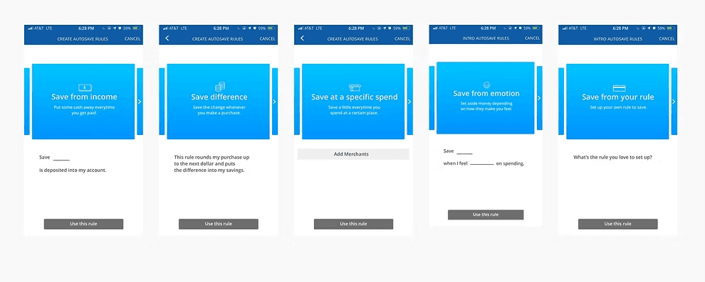
Based on the interviews I conducted and a survey specifically about saving, I was able to gather deep insights of users’ pains and needs. Most important data I learned that spending and savings are deeply related to each other and most of time, users save money to buy or spend for specific needs. Almost all of them need easier and better way to save more for their needs. The autosave features are directly made to solve their pains about saving.
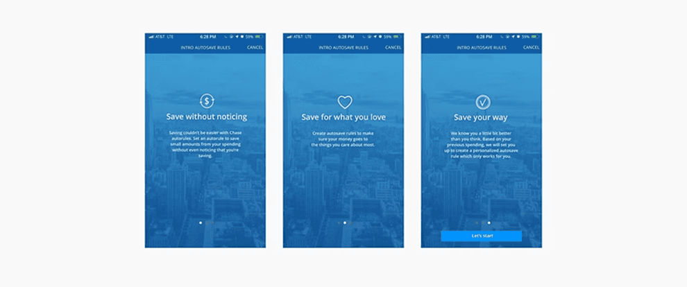
AutoSave Feature
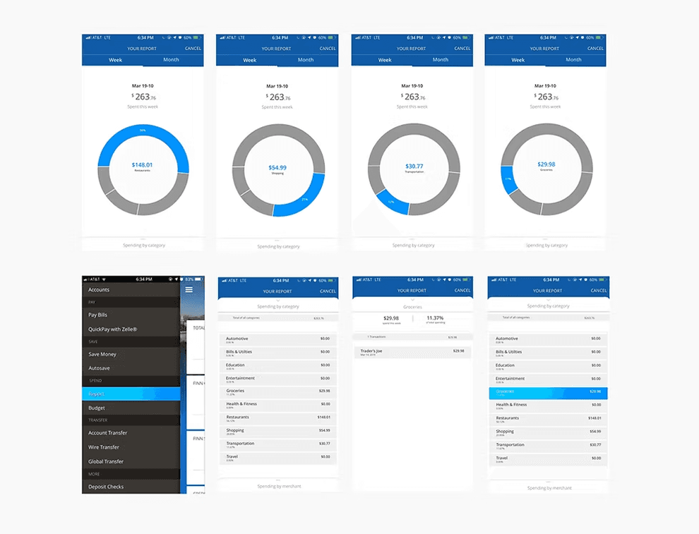
Your Report
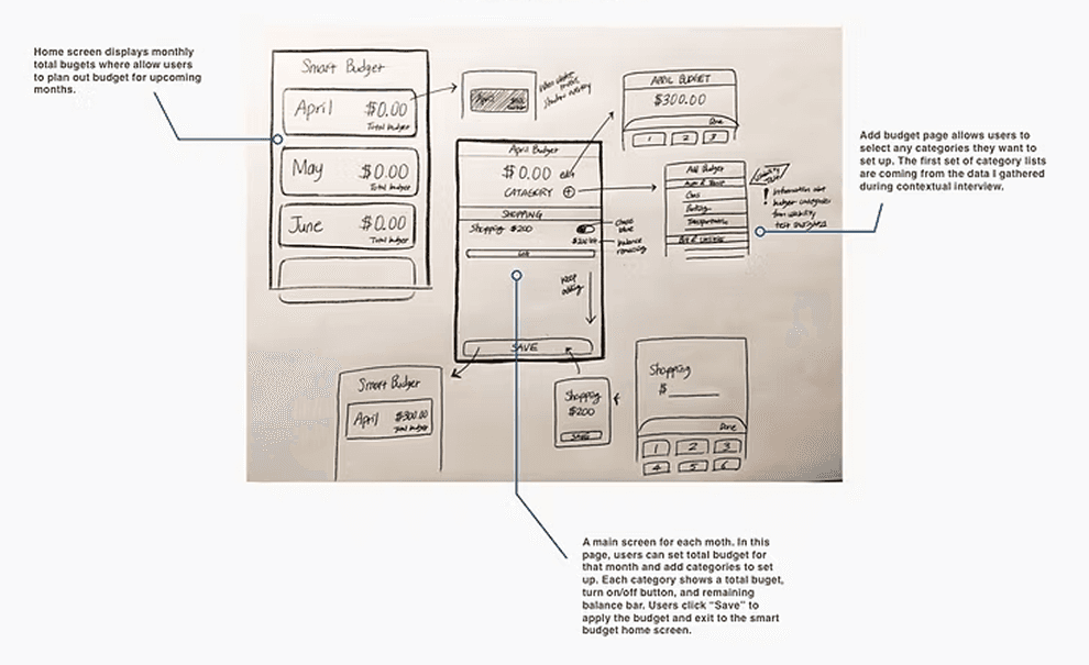
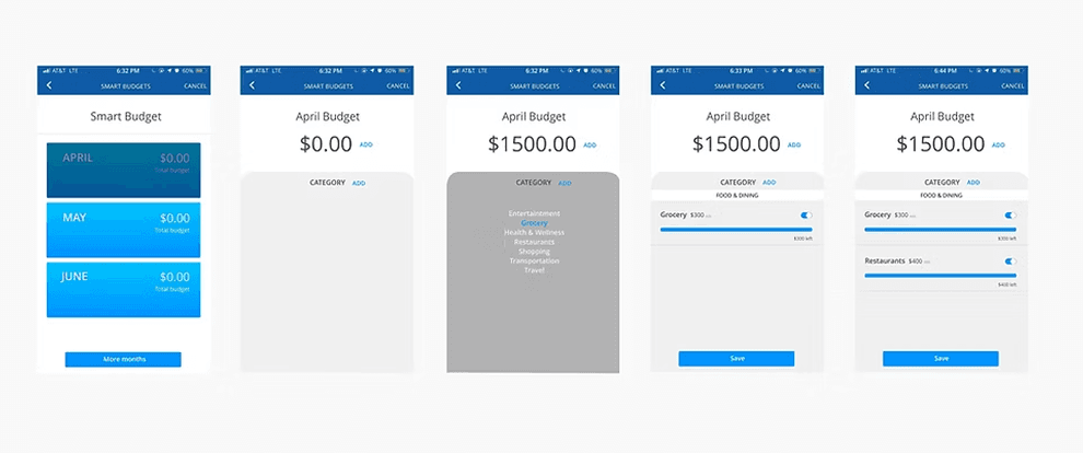
Smart Budget
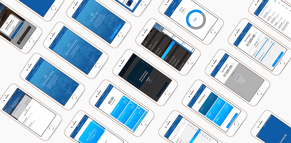
High-Fidelity Prototype
I then created high-fidelity wireframes in Sketch for a mobile app. The design were all based off of Chase’s existing mobile UI, often requiring me to match pixel to pixel. For autosave rules, I inspired from Finn’s current features. The wireframe demonstrated the look and feel of the new features and encourage useful feedback from stakeholders. With the high-fidelity wireframes, I created a mobile prototype in Marvel app to gather usability data from Chase users.
UI Kit
Based on the interviews I conducted and a survey specifically about saving, I was able to gather deep insights of users’ pains and needs. Most important data I learned that spending and savings are deeply related to each other and most of time, users save money to buy or spend for specific needs. Almost all of them need easier and better way to save more for their needs. The autosave features are directly made to solve their pains about saving.
Reflection
Although Chase already has a large user base, finding areas for improvement was a challenge. I tackled this by understanding the target users better. In the research phase, we realized that new features should handle financial tasks smoothly, without navigating through multiple pages. Our main focus going forward is to make expense tracking simple and maximize savings using the autosave feature.