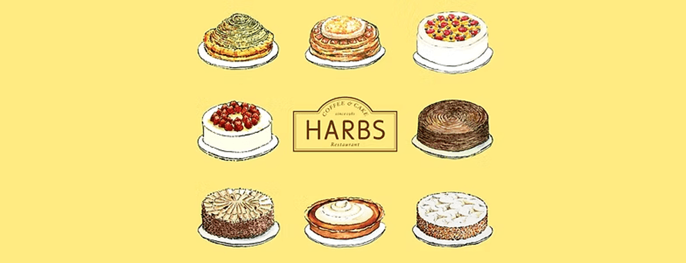
Harbs
Brand Website
UX Designer & Researcher
Case Study
The Challenge
Launch a new Harbs website for locals in NYC
Harbs stands as an artisanal haven nestled in the heart of Manhattan. With an unwavering commitment to embracing genuine freshness and unparalleled craftsmanship, the establishment has garnered an ever-expanding following since its inception on the vibrant streets of the Upper East Side back in 2014. This success story continues to unfold as Harbs proudly unveils its expansive boutique bakery in the trendy enclave of Soho. In a bid to seamlessly bridge the cherished in-person boutique encounters with a captivating online presence, Harbs is embarking on a journey to revitalize its branding. The aim is to encapsulate the essence of the boutique experience within the digital realm, giving rise to a rejuvenated website that resonates with the same allure and charm that have come to define their physical locations.
The Challenge
To redesign a responsive website for Harbs.
To develop Harb’s branding that is cohesive with its current brand direction
Market Research
Research & Analysis: Research began with competitive and industry analysis to understand Millennial banking behaviors and mobile-first finance trends. This was supported by contextual inquiry interviews with students, professionals, and entrepreneurs, which revealed that while users trusted Chase for core banking, many found financial management tools overly complex and lacking personalization. These insights highlighted an opportunity for Chase to expand beyond transactions into goal-oriented financial management.
Information Architecture: Based on research findings, the app’s information architecture was restructured to support new personal finance features while preserving Chase’s existing navigation patterns. Autosave, budgeting, and reporting tools were organized around user goals, reducing friction and allowing new features to feel naturally embedded within the current app experience.
Wireframing & Prototyping: Low-fidelity wireframes were created through sketches and whiteboard exercises to quickly validate layouts and user flows. After refining the structure, high-fidelity wireframes were designed in Sketch, closely matching Chase’s UI patterns, and connected into an interactive mobile prototype in Marvel to simulate real user interactions.
Usability Testing: Usability feedback was gathered through prototype walkthroughs focused on key tasks such as setting up autosave rules and managing monthly budgets. Testing emphasized the importance of minimizing steps and keeping users within a single, continuous flow, leading to refinements in navigation clarity and visual hierarchy.
Visual Design & Style Guide:A cohesive visual system was created to extend Chase’s existing brand across the new features. This included defining color usage, typography, and reusable UI components, supported by a style guide and UI kit to ensure consistency, scalability, and future design alignment.
Market Research
My initial step involved delving into the wealth of online information pertaining to Harbs and its strategic business trajectory. Beyond merely placing a premium on meticulously handcrafted confections, this café holds the holistic dining journey in the highest regard. A significant factor contributing to Harbs' widespread acclaim is its unwavering commitment to delivering patrons distinctive and unparalleled dessert encounters, designed to be savored and shared, thereby solidifying a strong brand connection.
The prospect of crafting a new website presents an unparalleled platform to effectively communicate and impart these cherished principles to prospective patrons prior to their physical visit. Moreover, the research underscores Manhattan's saturated culinary landscape, wherein a multitude of dining establishments flourish. However, amidst this thriving competition, the quest for superlative dining experiences remains unabated. This underscores the heightened significance of establishing a robust online presence, pivotal for positioning Harbs favorably and competitively amid the bustling dining scene.
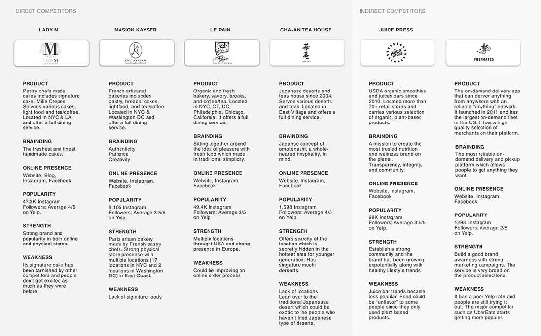
Competitive Analysis
Given the intense level of competition in the market, a comprehensive assessment of Harbs' standing relative to its rivals emerged as a pivotal task. Consequently, I meticulously pinpointed both direct and indirect contenders, entities catering to a similar clientele as Harbs, and proceeded to dissect their online profiles and information. This analytical juxtaposition furnished invaluable insights into customer expectations, enabling a nuanced comprehension of how Harbs could strategically position itself vis-à-vis these formidable competitors.
In the grand scheme, Harbs appeared to be executing commendably, amassing local acclaim and orchestrating captivating dessert escapades for its patrons. Nonetheless, there existed an opportunity for enhanced growth, particularly through fortifying its online visibility and refining the efficiency of its order processing mechanisms. Such enhancements hold the potential to yield a pronounced uptick in overall revenue, propelling the brand's trajectory towards a more expansive customer base and heightened success.
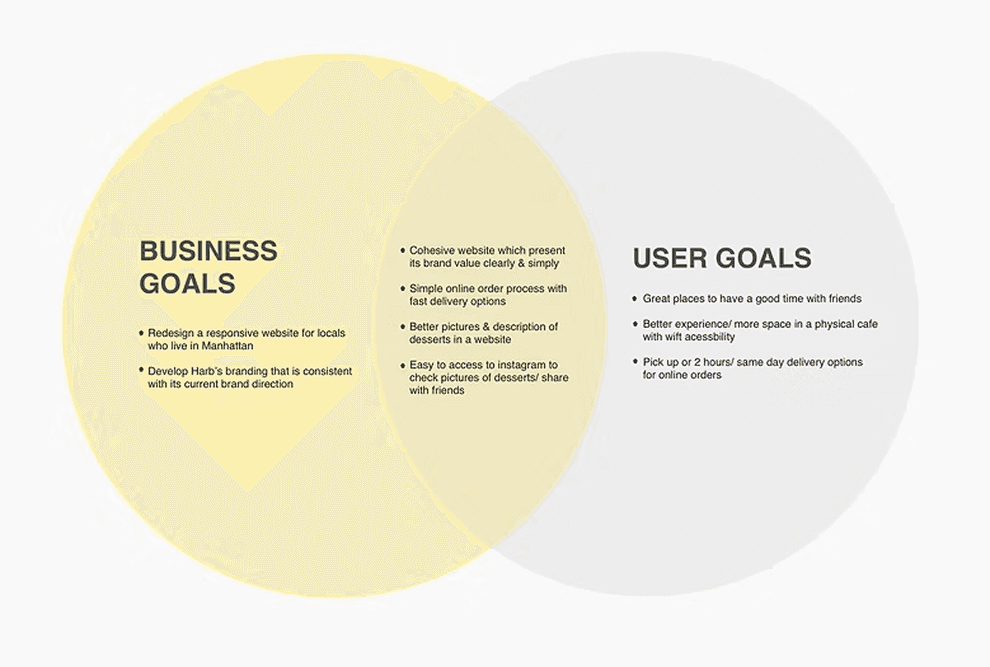
Define User
In my quest to delve deeper into the realm of customer experiences within the Harbs domain, I initiated a series of contextual inquiry interviews. The participants included a spectrum of individuals: 5 devoted Harbs patrons, 2 unacquainted with the Harbs experience, and a dedicated Harbs employee. This comprehensive exploration unfolded across three distinct locales: the vibrant enclaves of Soho, Chelsea, and the illustrious Upper East Side.
These insightful interviews encompassed a multifaceted spectrum, probing into the discovery odyssey of dessert enthusiasts, their tactile encounters within physical Harbs establishments and their virtual sojourns on the web. Additionally, the discussions traversed the array of resources they deploy in their quest for delectable confections. Adding a layer of depth, an exclusive dialogue was curated with a server stationed at the Soho locale, yielding privileged insights from an insider's perspective. This holistic approach also encompassed keen observations spanning individuals, culinary offerings, and the ambient vibes.
Number of Participants: 8
Gender: 5 females / 3 males
Age: 22-39 yrs old
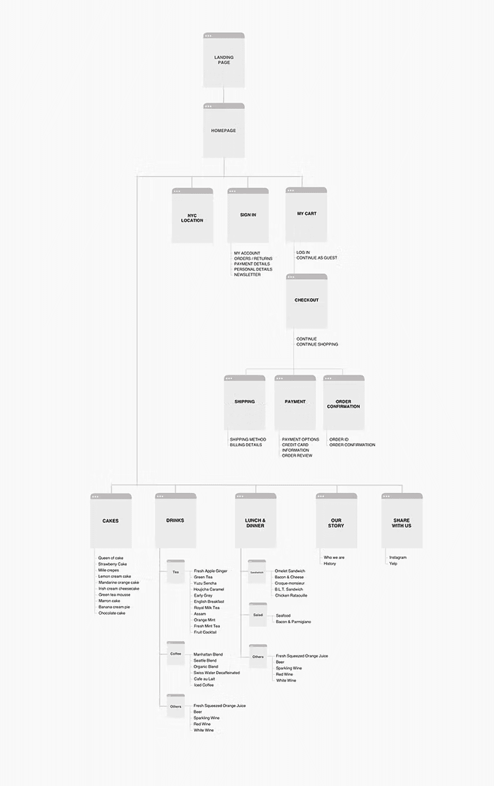
Sitemap
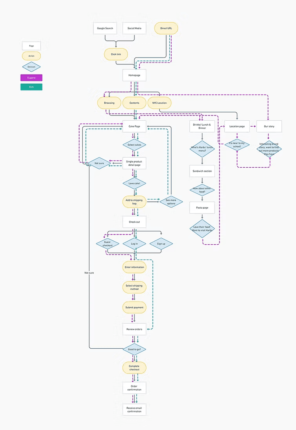
User Flows
To analyze the flow of the new features, I mapped out various ways of user flows based on scenarios I found from the primary research. This helped me learn which screens and UI elements were needed to implement the new features, while considering how to optimize use flows.
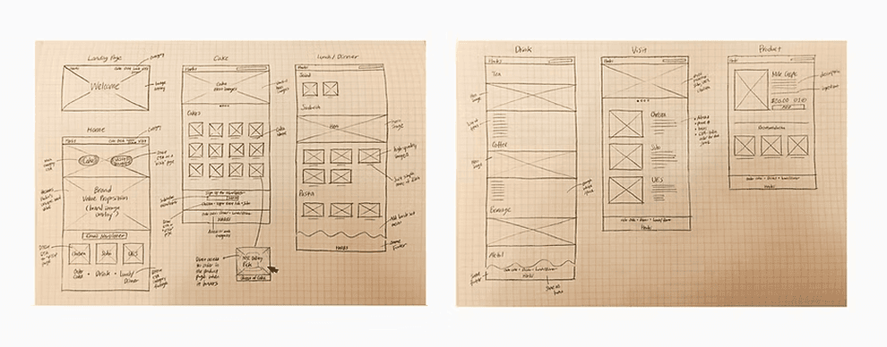
Sketch
For designing the UI, I started out with rough sketches of the pages. Then I began to build a sketch wireframe to understand a whole process at a quick speed. I was able to quickly captures the layouts of all pages and understand clearly which pages I need to build. During this process, I referred to examples of restaurant websites and studied existing design patterns that make for a more intuitive user experience.
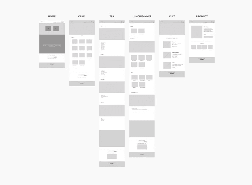
Wireframe
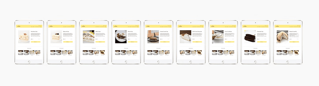
I then created mid-fidelity wireframes in Sketch, including desktop, tablet, and mobile versions for each page. This helped me focus on main layout and visual hierarchy of the website across responsive screens.
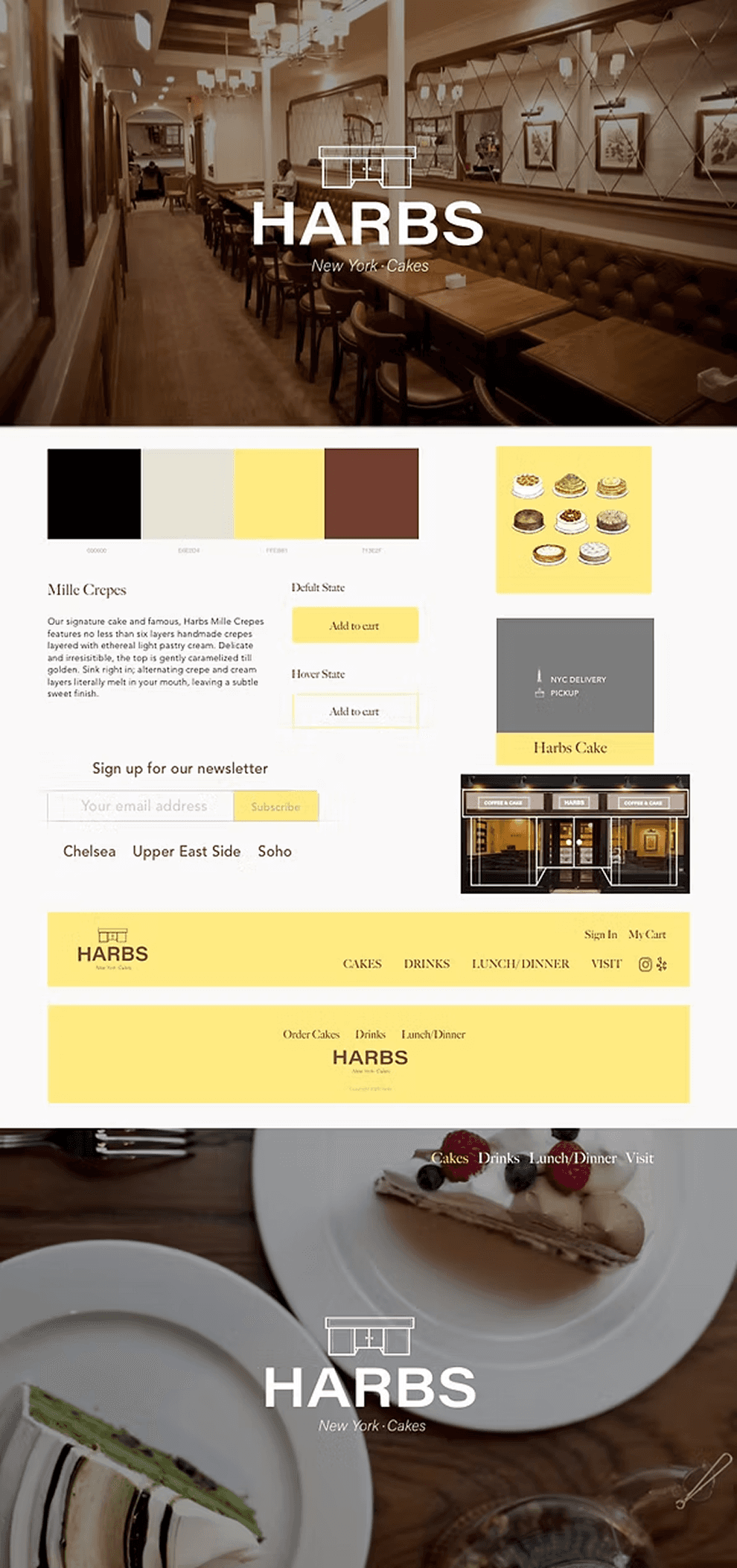
Style Guide UI Kit
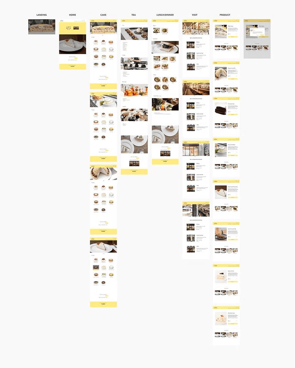
High-Fidelity Wireframe
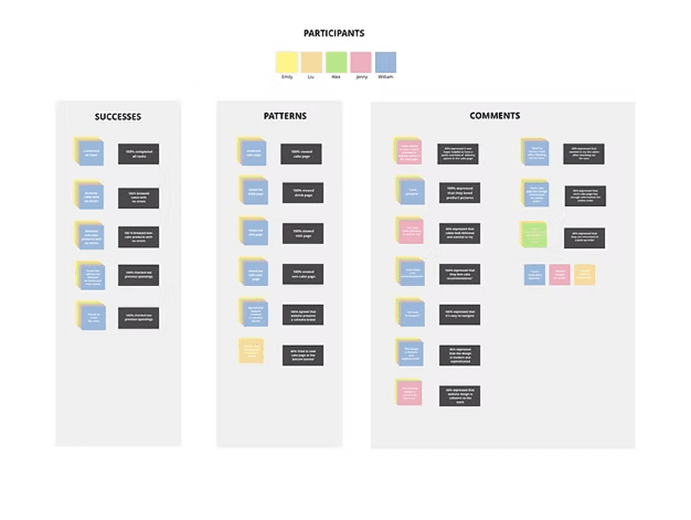
Affinity Map
Based on the usability test, I created an affinity map to synthesize the usability findings, identifying reoccurring behaviors and feedback. This allowed me to better understand the usability of the current design. In the end, the synthesized data indicated no changes were needed for the current design.
Reflection
All in all, this endeavor proved to be refreshingly uncomplicated, primarily owing to the website's predominantly informative nature, tailored to a wide-ranging demographic. Among the key insights gleaned, a notable enhancement surfaced in my adeptness at crafting responsive web designs, alongside the art of sculpting a brand identity in alignment with clear-cut audience anticipations. As I gaze towards the horizon, my next step entails collaborating with developers, where the synergy between design and implementation shall be unveiled, breathing life into the envisioned website.
All in all, this endeavor proved to be refreshingly uncomplicated, primarily owing to the website's predominantly informative nature, tailored to a wide-ranging demographic. Among the key insights gleaned, a notable enhancement surfaced in my adeptness at crafting responsive web designs, alongside the art of sculpting a brand identity in alignment with clear-cut audience anticipations. As I gaze towards the horizon, my next step entails collaborating with developers, where the synergy between design and implementation shall be unveiled, breathing life into the envisioned website.